Over the past week, Google has released the new international typeface “Noto”, designed by Monotype.
Unlike any typeface before, Noto connects every written language in use around the world using the same typeface.
The project reportedly took Monotype five years and spans over 100 written scripts and 800 languages. But was it worth it?
Noto Comparison in different languages
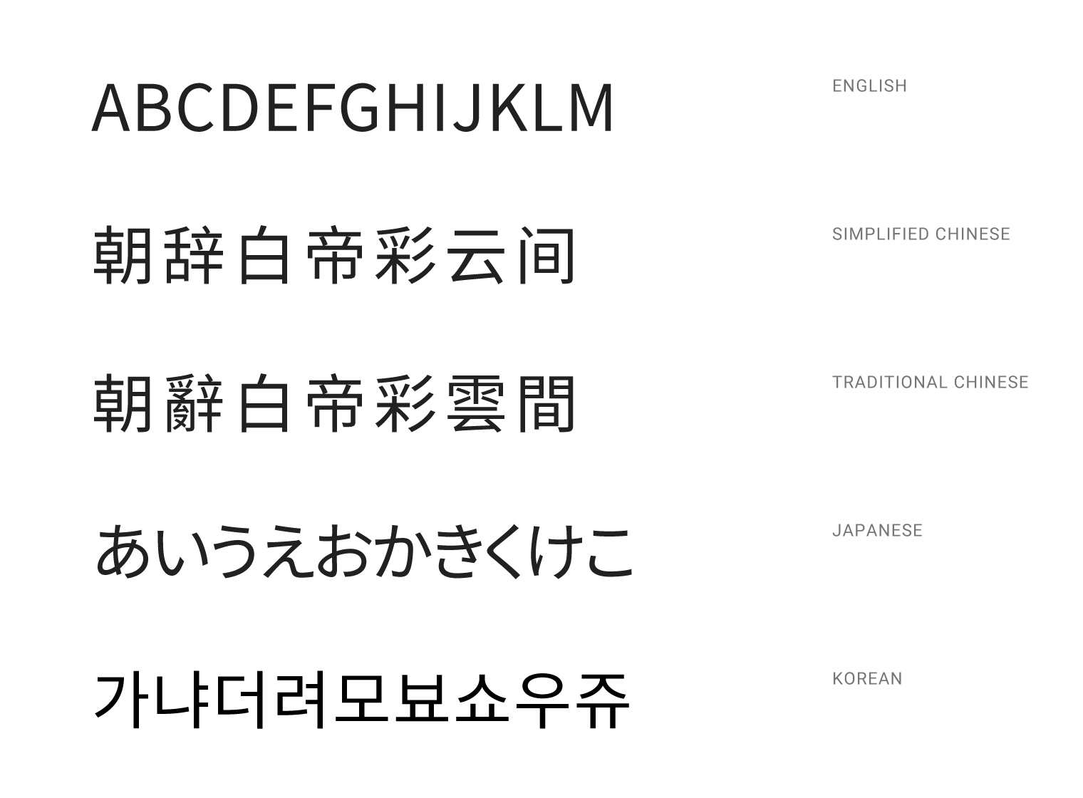
The benefit really comes from use on websites where certain fonts aren’t able to be displayed in many languages. Noto is very effective in keeping consistency in lettering styles while reading web pages in multiple languages. In this sense, I feel like the typeface is great design.
But how does Noto stack up against other fonts when multiple languages aren't involved?
After using Noto Sans over the last few days for various bits and pieces, I feel Noto can hold its own in the world of typefaces. As with all good typefaces, Noto is easy to read and has its own character created in the type spacing and fluid letters. I feel like it’s a bit quirky and professional at the same time.
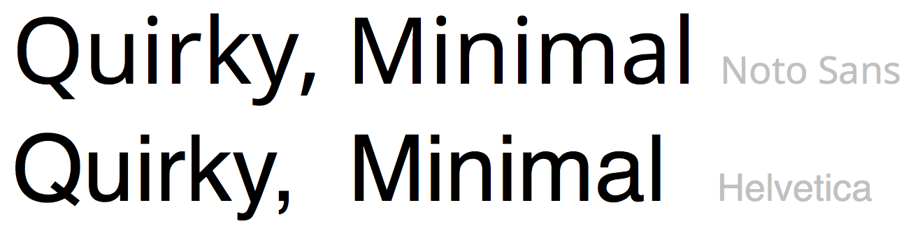
Great font design has to be functional. Noto completes the function it was designed for in the same way Helvetica completes the function of being minimal yet effective. It’s like comparing a whiteboard marker and a pencil. You can write with each item, but they are for use in very different situations. Each font/product is great design because of how they serve their purpose.